Problem
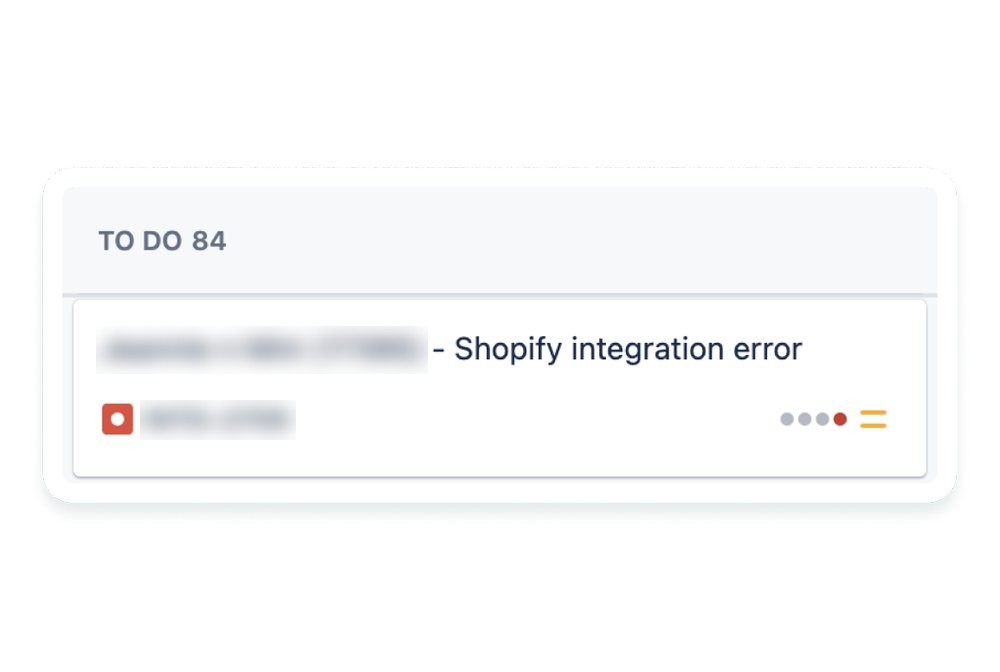
Routine changes to sign-up units required engineering. The manual, repetitive work increased costs and took engineers away from higher-impact projects.
Goals
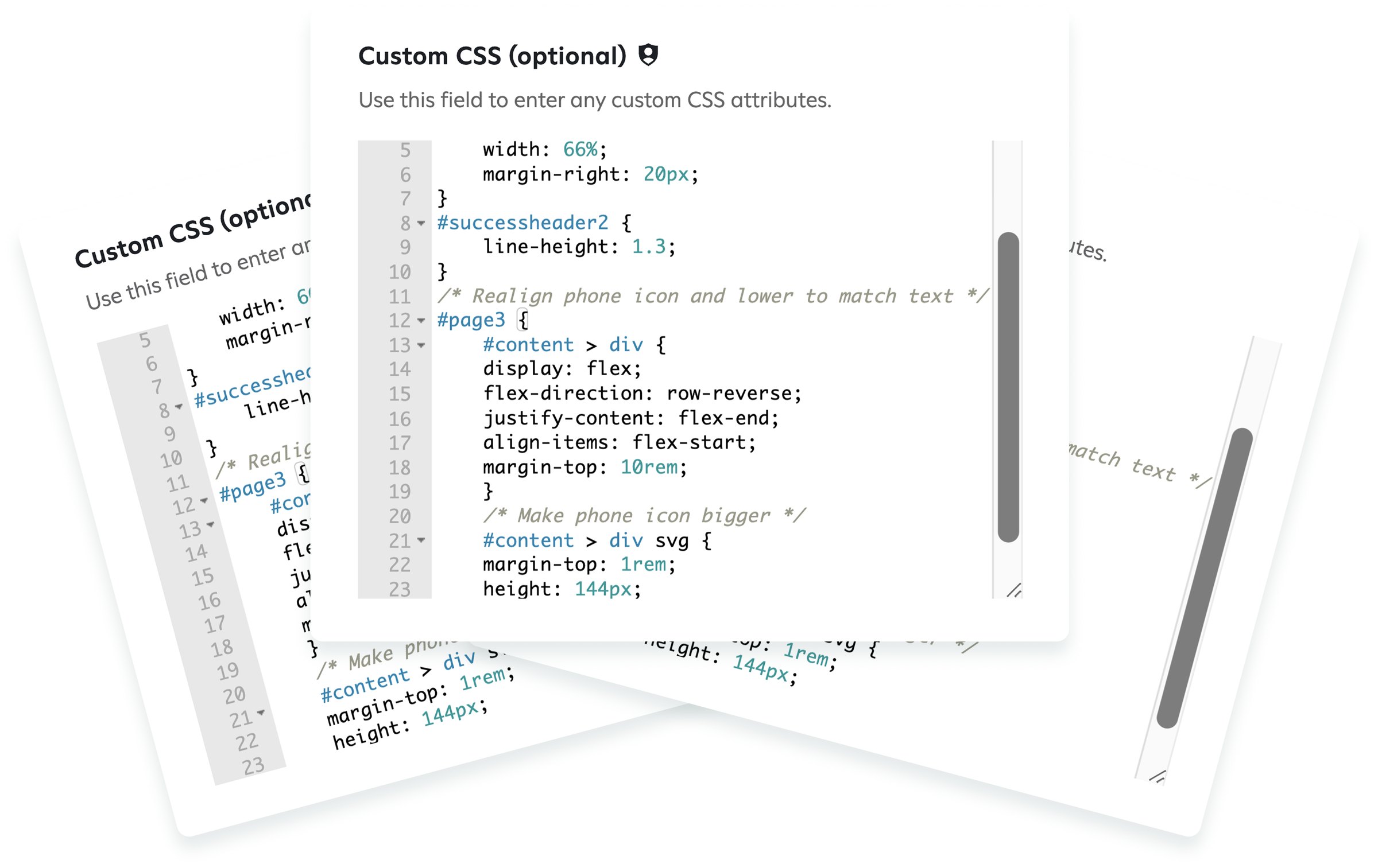
Remove engineering from routine changes and reduce client-side bugs, especially CSS and rendering issues caused by custom code, so units render correctly on every platform and device.
Approach
Expand what the builder can do and make it easier to use. Automating complex steps and building customization into the tool reduces the errors that come with custom code and lets internal teams ship more sign-up units in less time.
Early wireframes
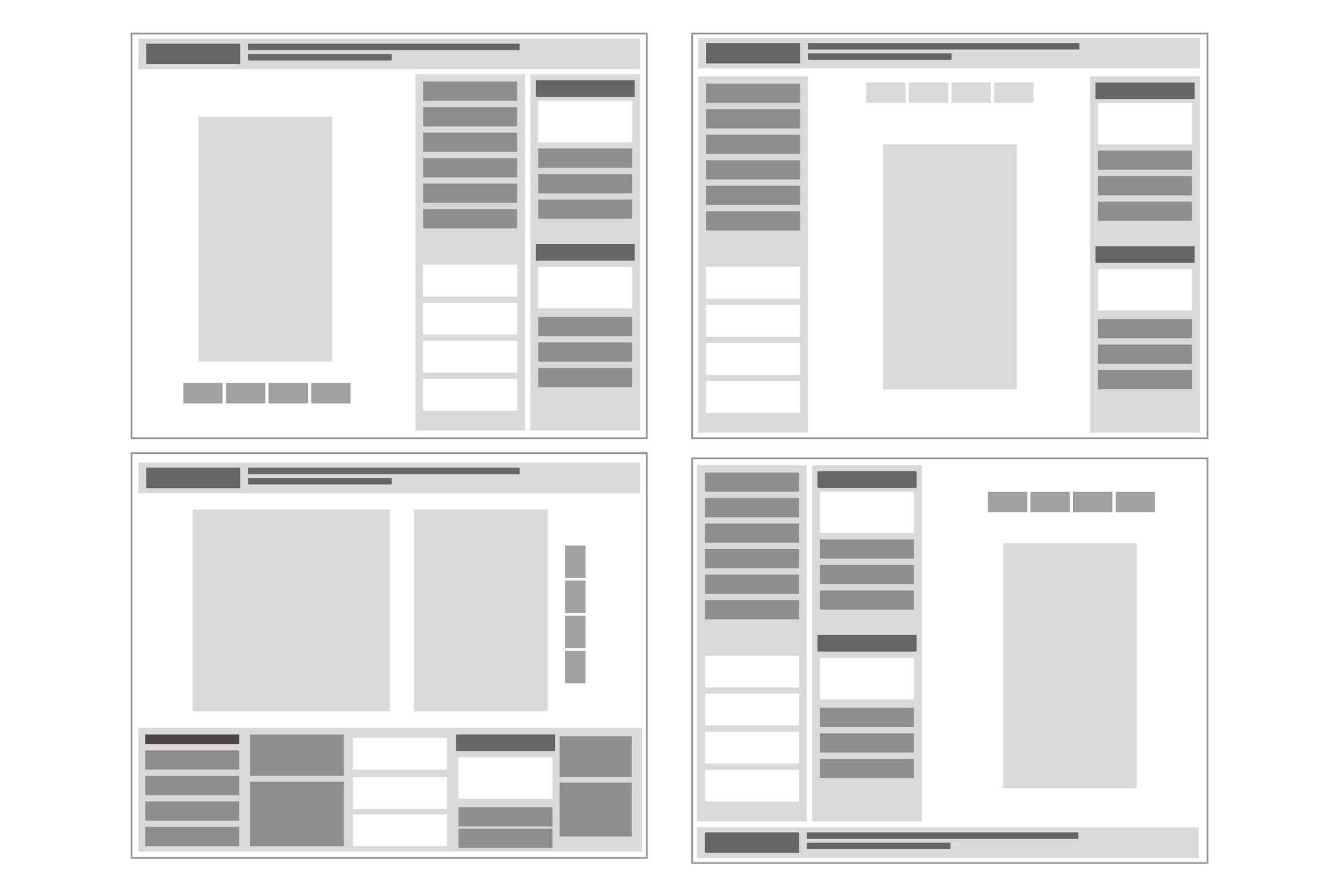
I explored several layouts and ran a competitive analysis of the tools our clients already used, so the new builder would match their mental models. I also audited the previous builder to decide what to keep and what to change.
Reducing cognitive load
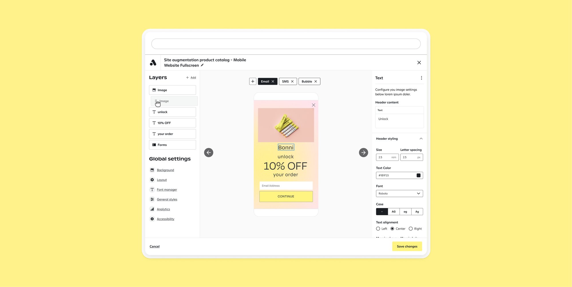
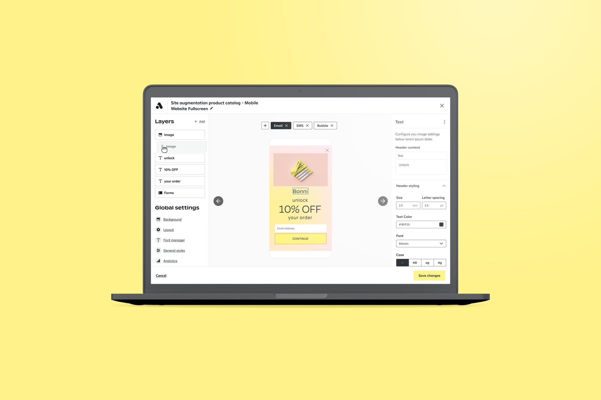
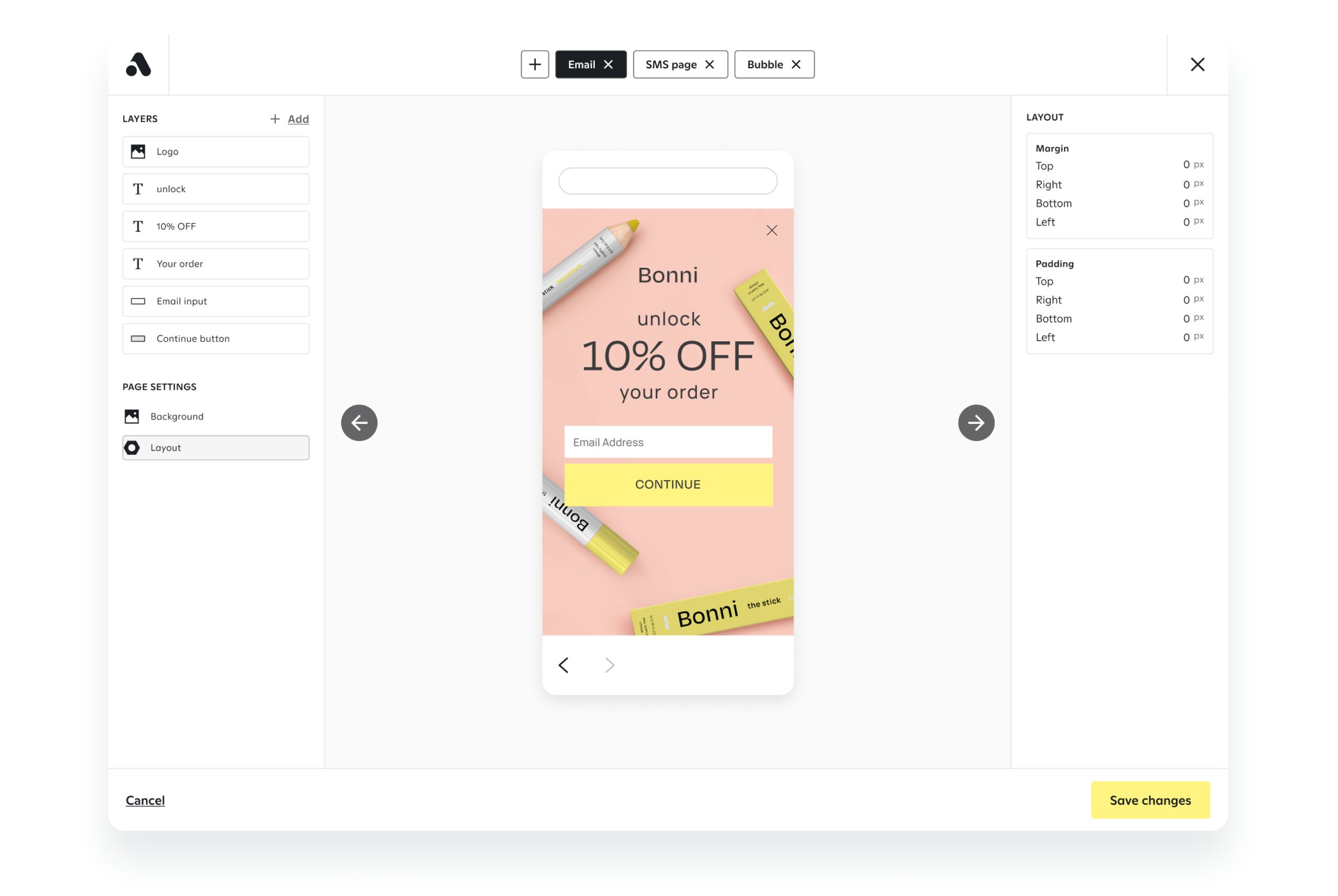
The first iteration kept what worked and fixed what didn’t. It introduced dual side panels, matching the layout of industry-standard editors and making the interface easier to scan.
Drag-and-drop editing
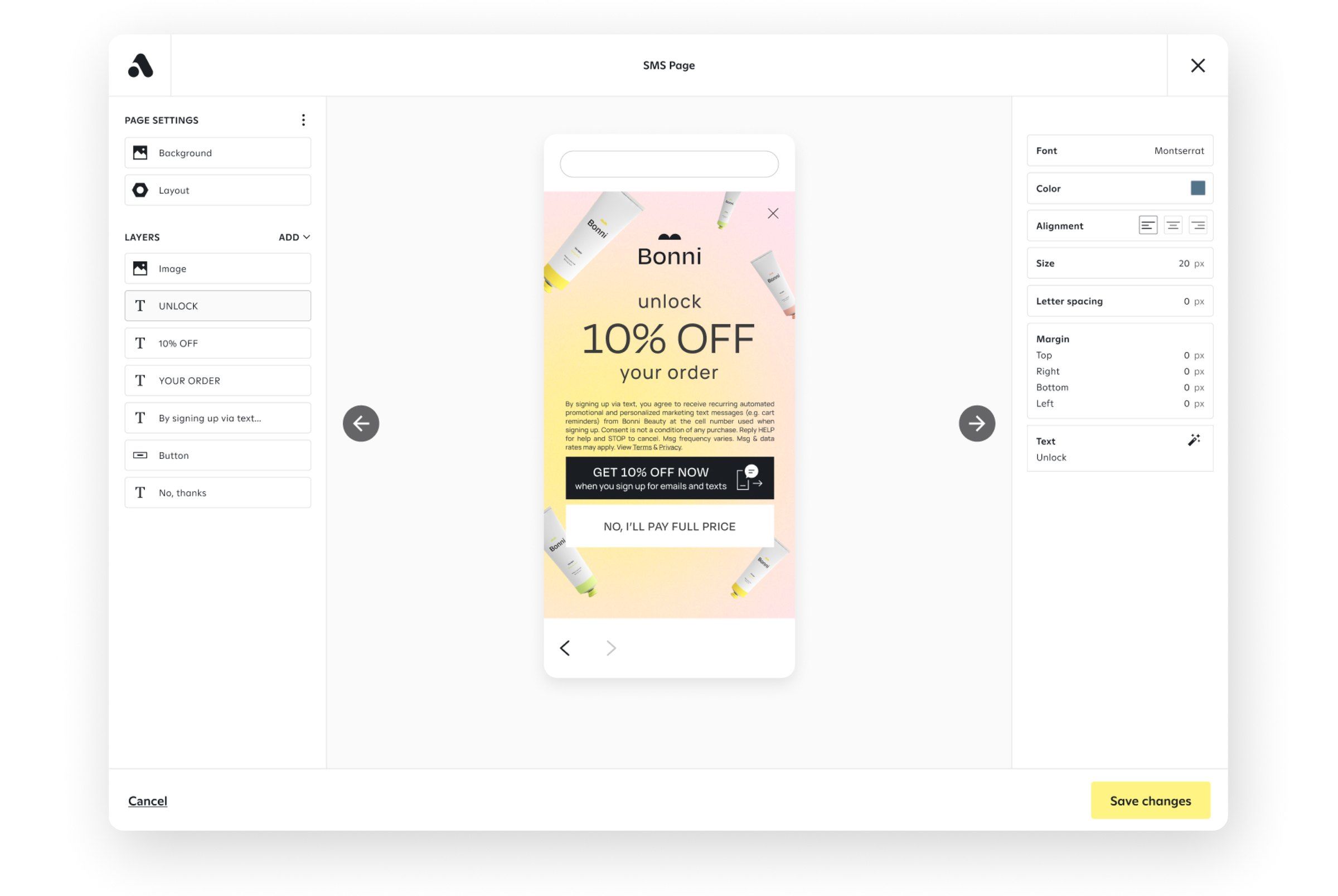
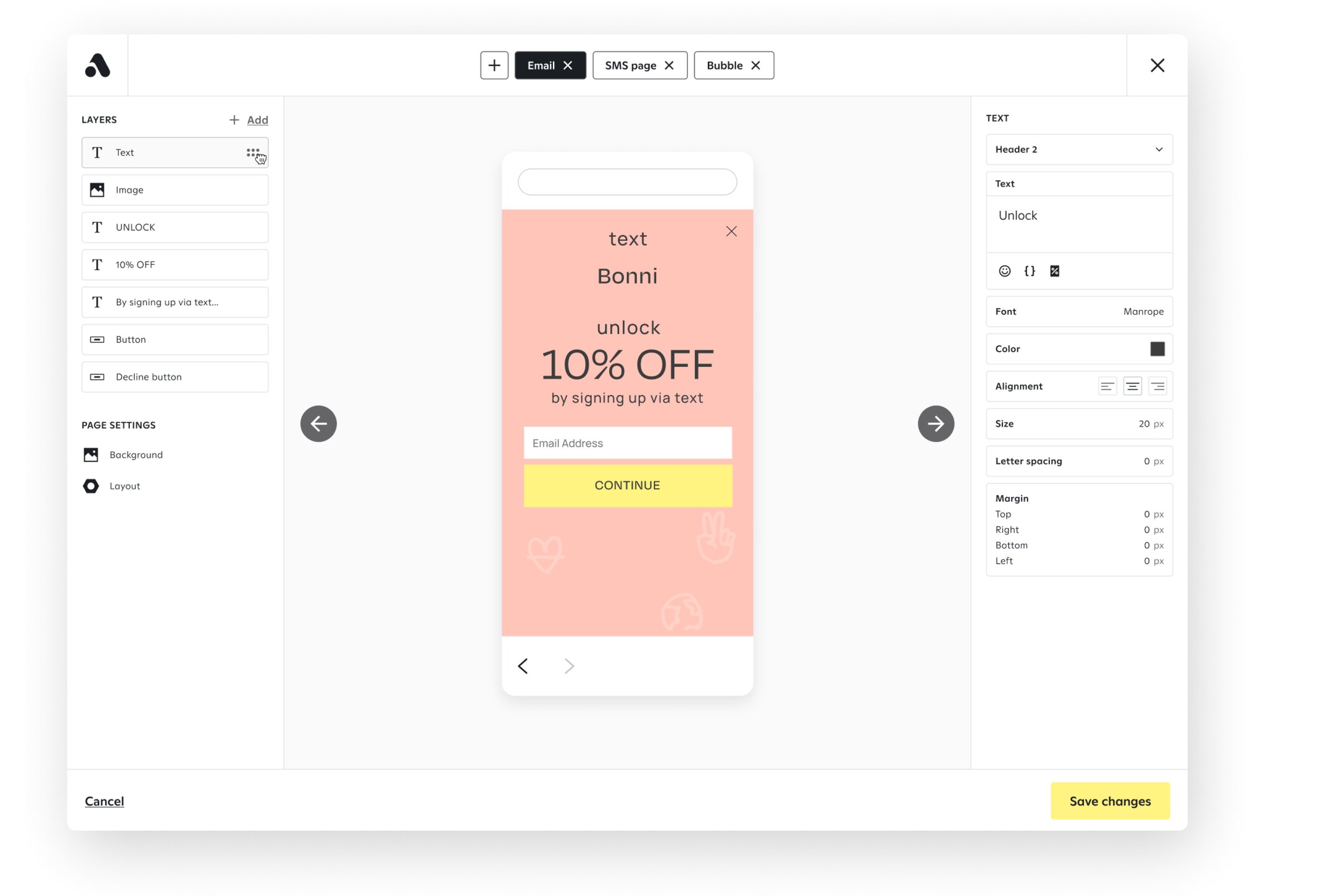
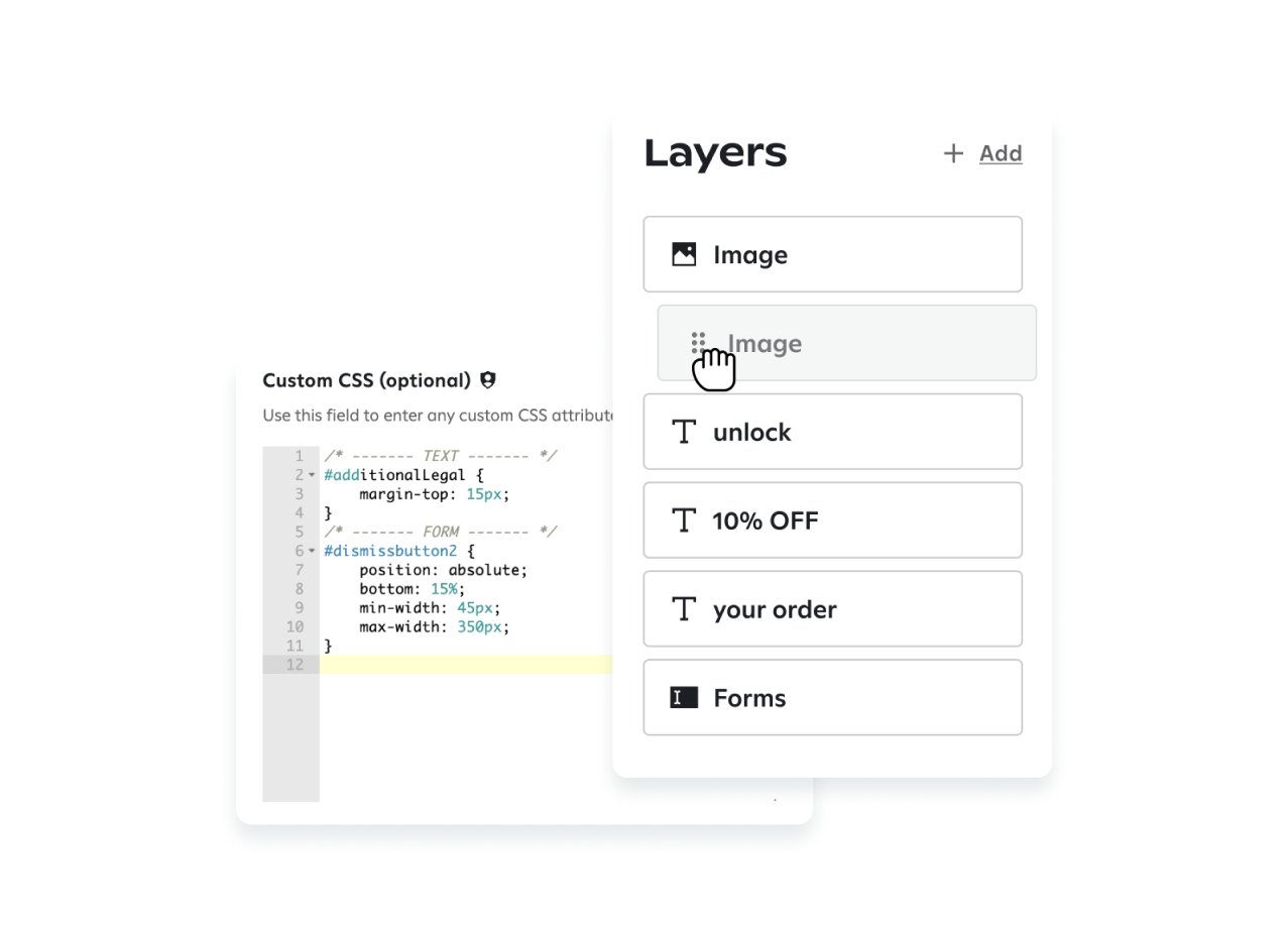
The most common client request was reordering components without writing CSS. A drag-and-drop editor removed over 60% of CSS-related use cases, made the builder usable for non-technical marketers, and strengthened Attentive’s competitive position.
Client research
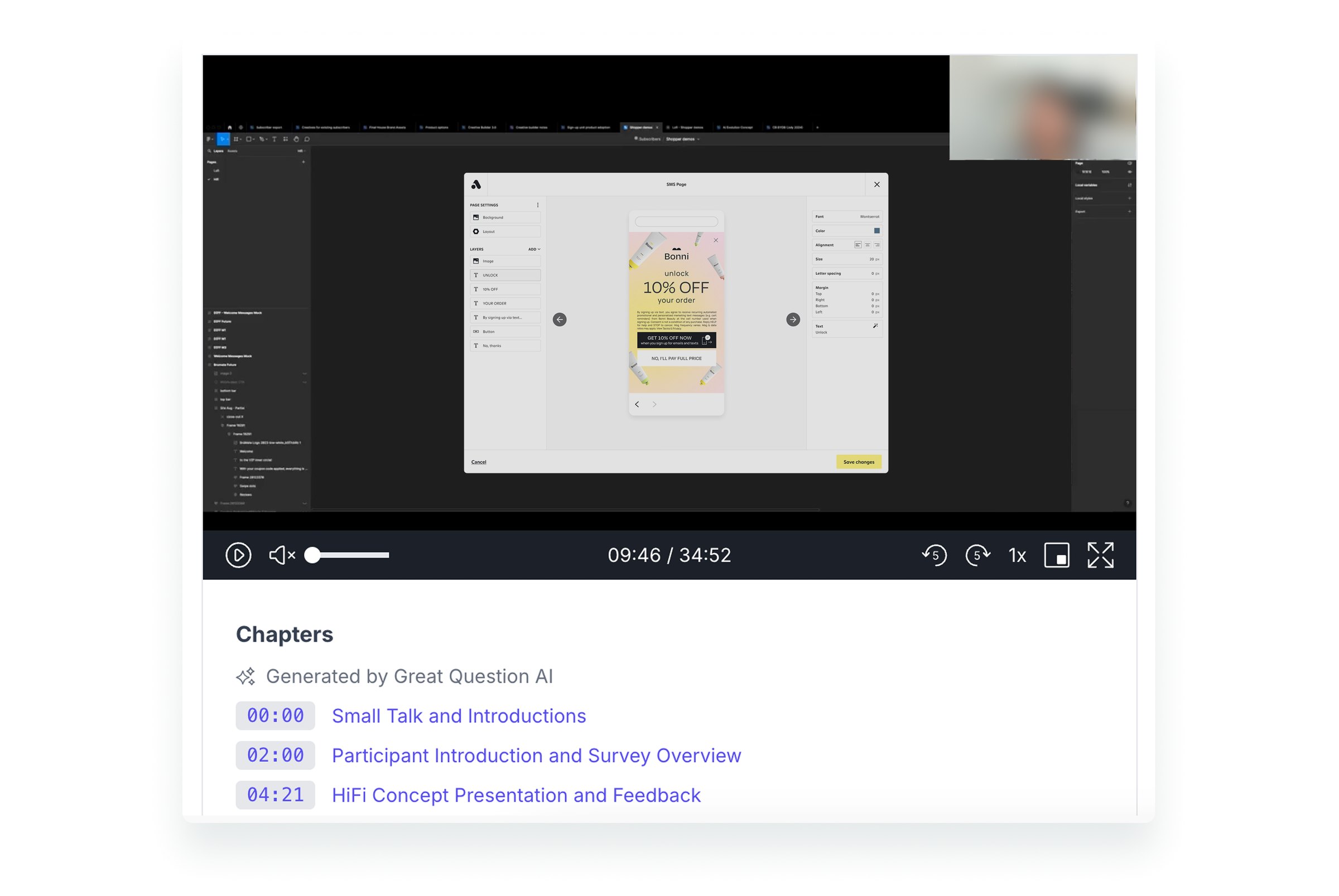
I ran client interviews through Great Question AI to surface needs, pain points, and feature expectations. These findings guided key decisions and supported the launch and adoption of CB3.
Modular components
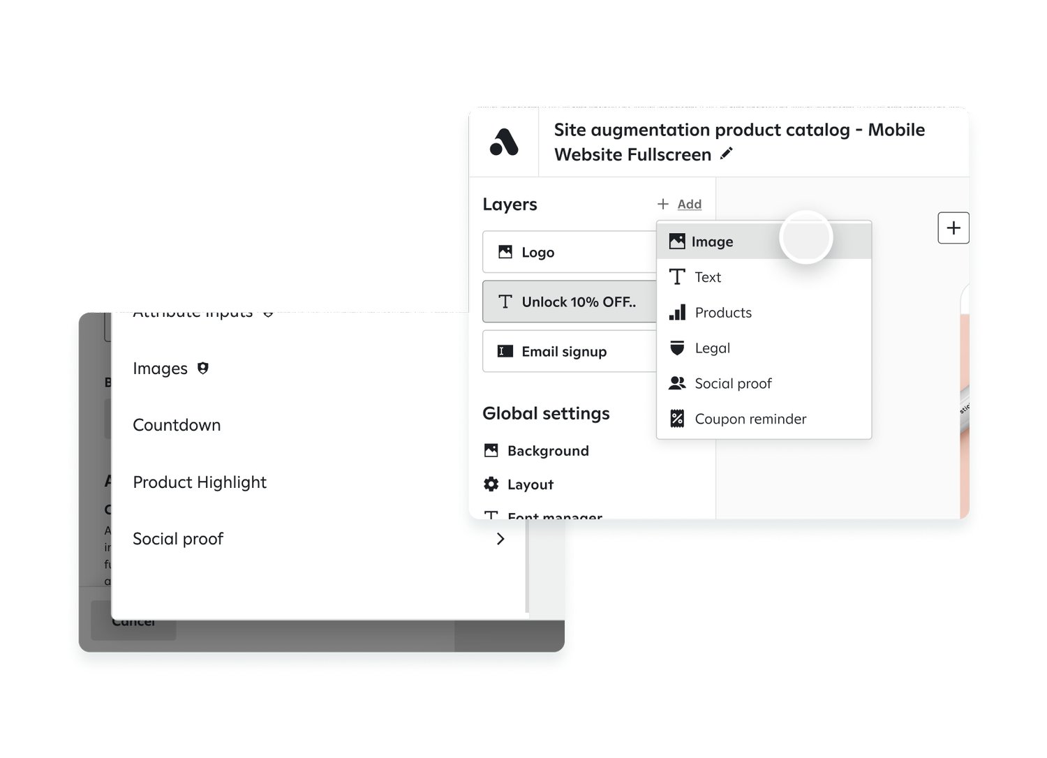
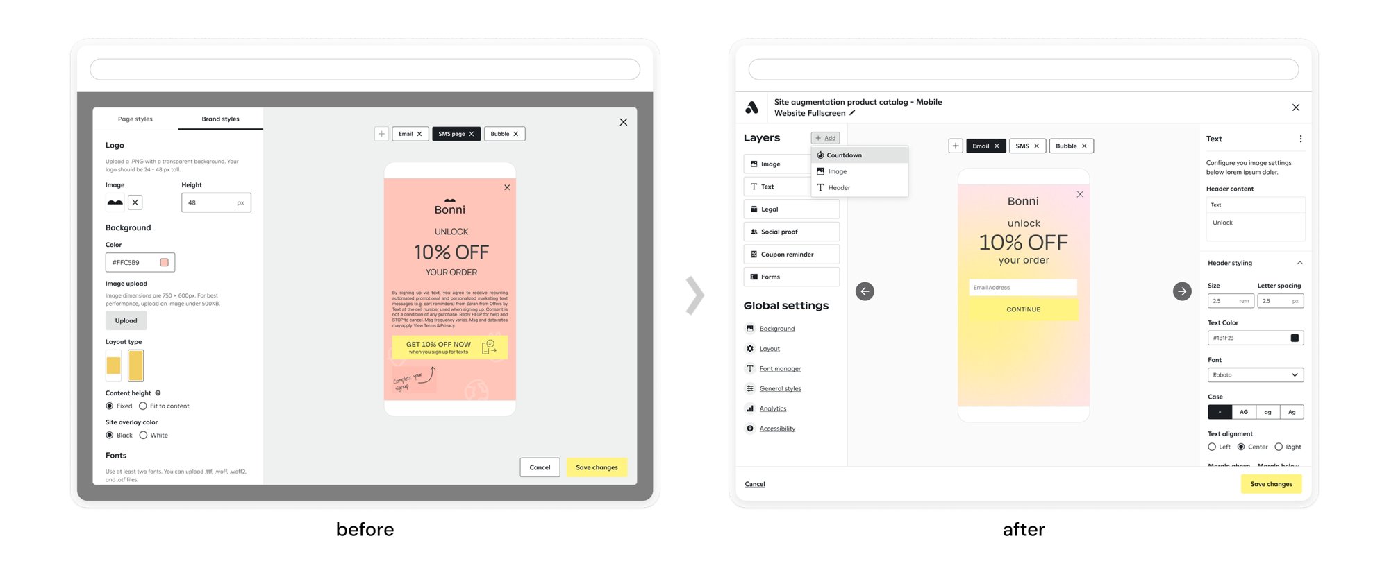
Modular building blocks let designers combine components to fit each brand while keeping campaigns consistent.
Standardized templates
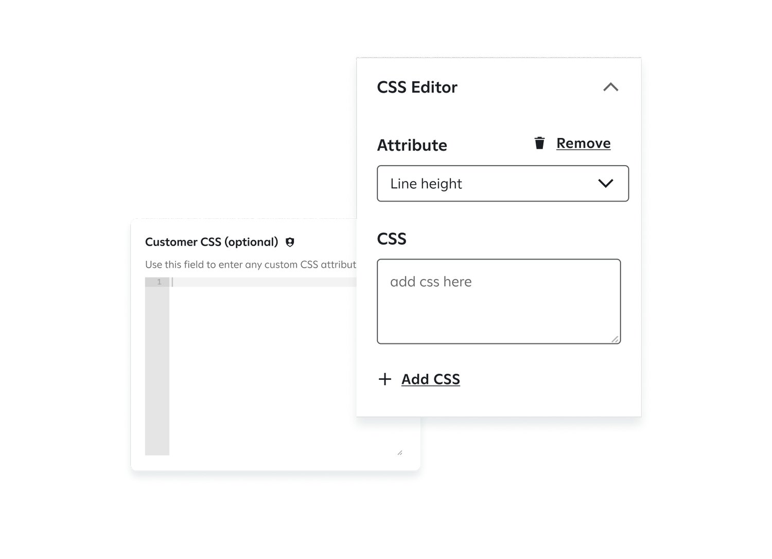
When custom CSS is needed, it now works within standardized templates. This structure reduces bugs and rendering issues without removing customization.
Template and layout switching
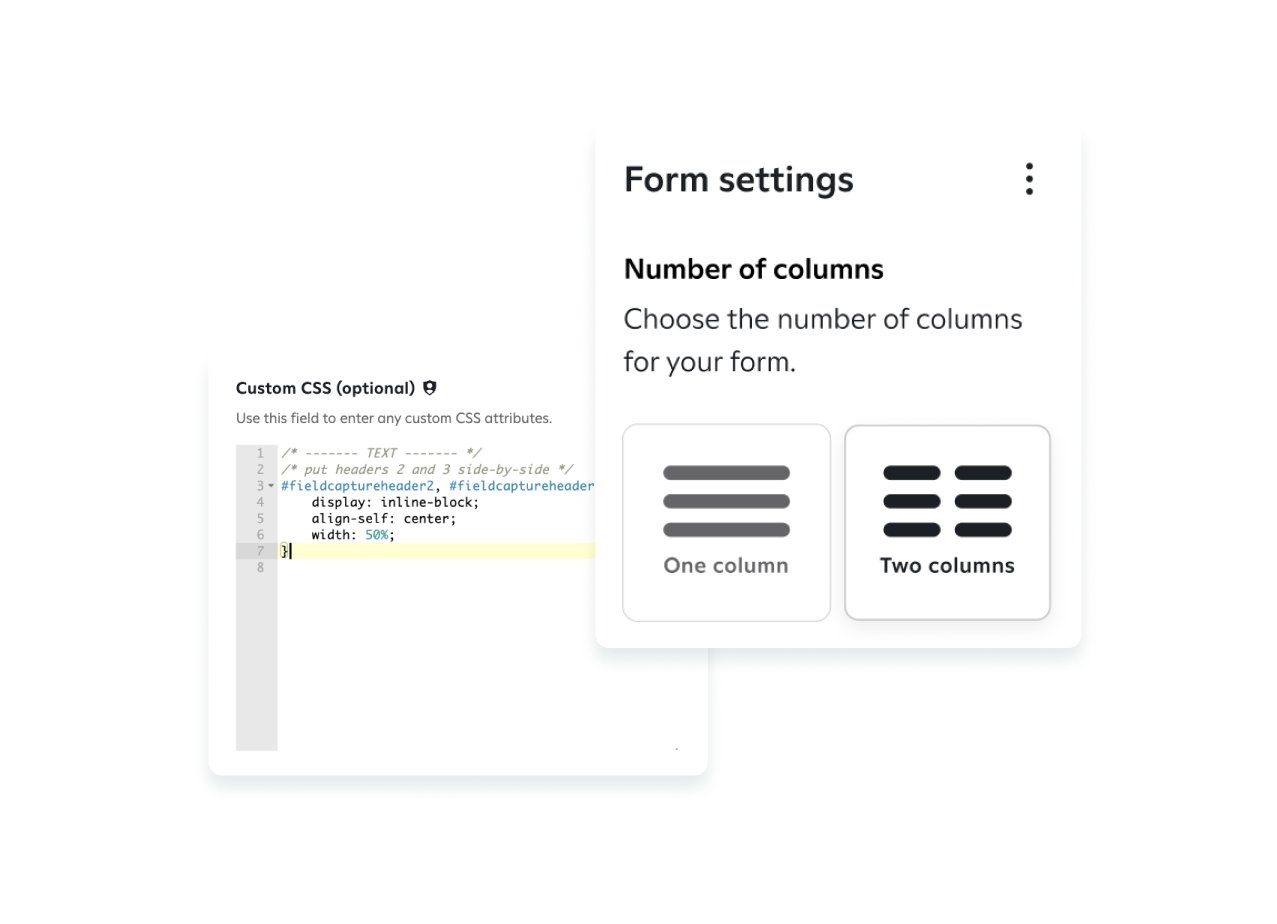
Users choose from multiple templates and layout styles and can switch between them at any point, adapting a unit to different brand styles and campaign goals.
Accessible content order
Users can reorder layers so screen readers follow the intended content order rather than the visual layout, which makes sign-up units usable with assistive technology.
Before and after
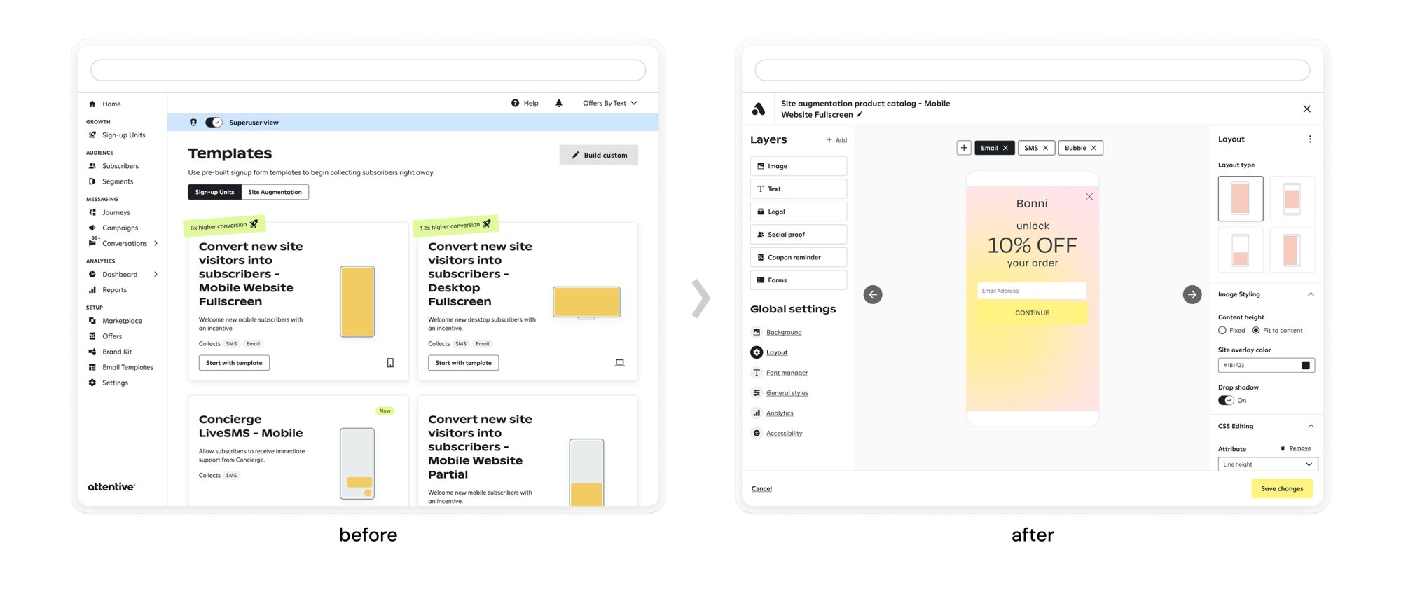
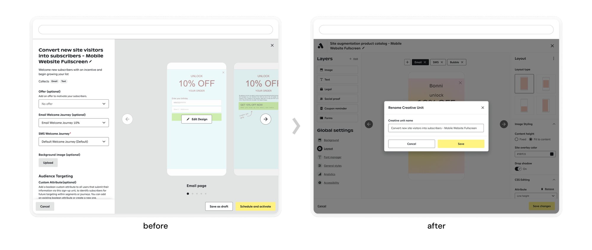
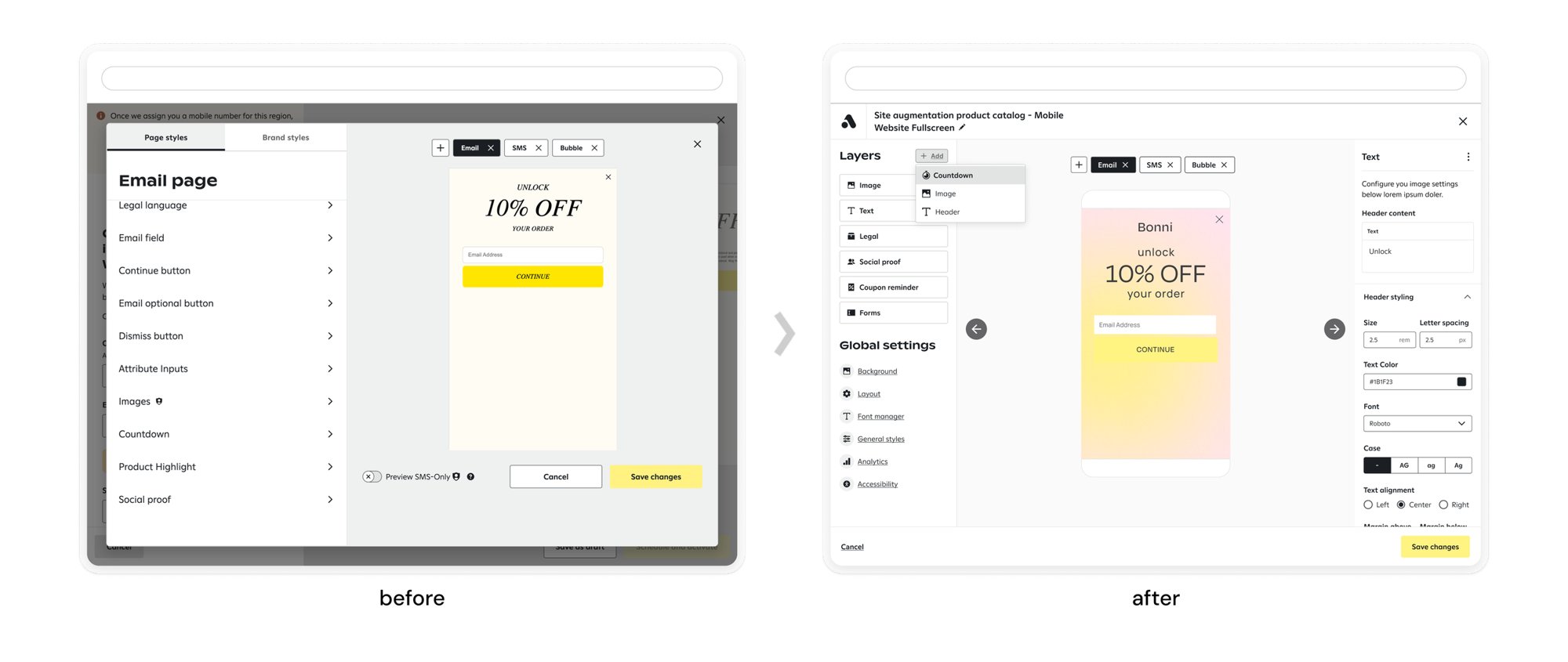
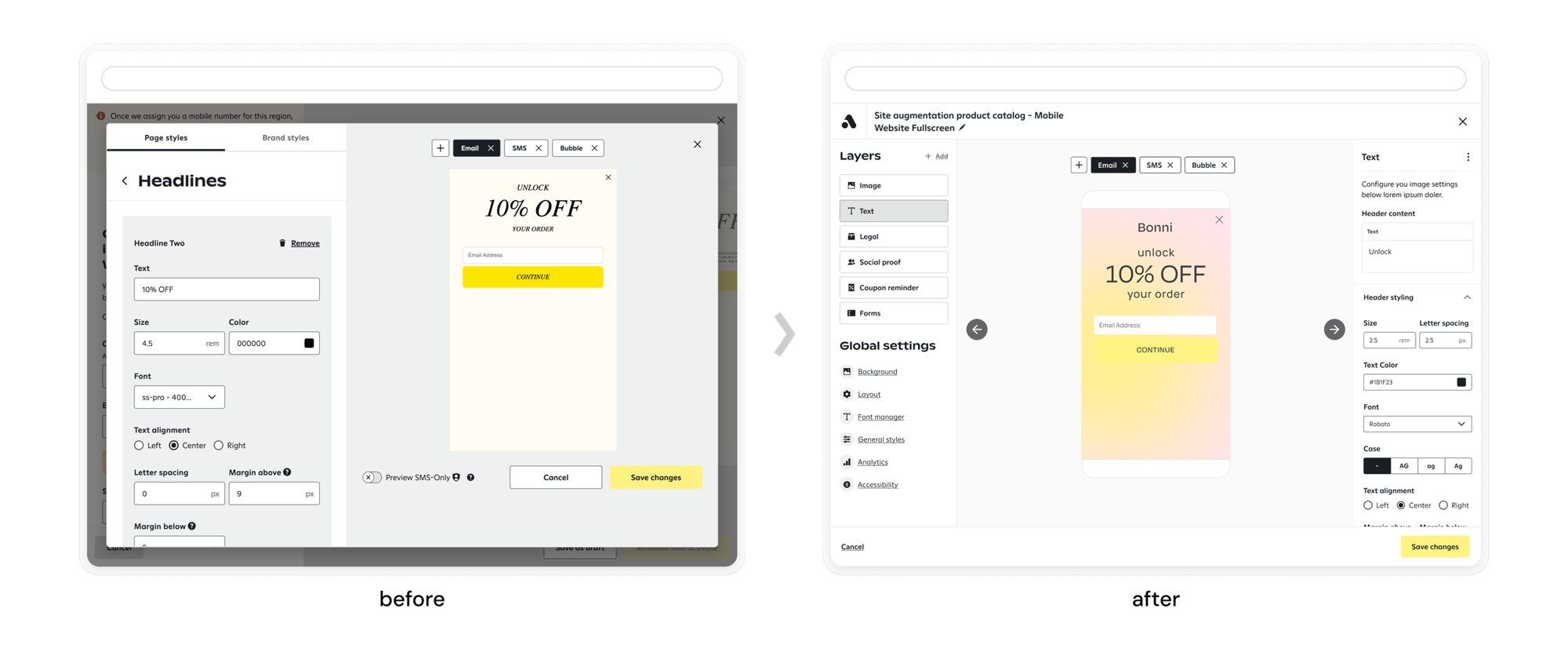
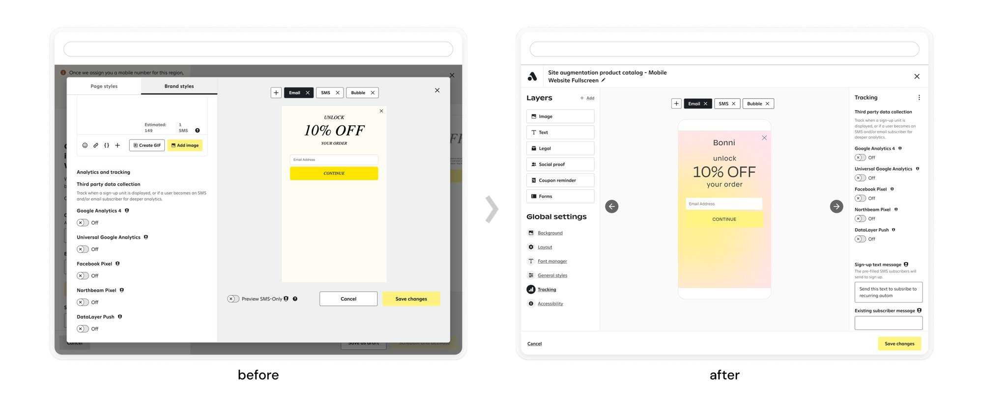
The previous builder split work across setup pages, tabs, and nested forms. The redesign brings everything into one editor: layers on the left, the live preview in the center, and settings for the selected element on the right.
Results
- 55%
- less engineering workload, reducing tech debt
- 67%
- less custom CSS, resulting in fewer visible bugs
- 42%
- higher user retention, tied to a 35% revenue increase
Business impact
Templates, layer management, and automated CSS made the builder more flexible, accessible, and efficient. Clients make fewer errors and produce higher-quality sign-up units, which strengthened Attentive’s position in the market.